Enjoy yourselves.
Breakfast rounds
After the thaumatrope adventure a couple of weeks back, we thought we'd try another early animation technique. This is a phenakistoscope ... another snappy name that's easy to remember.
The original phenakistoscopes were discs mounted on a handle, a little like a child's windmill. The idea was that you stand in front of a mirror, spin the disc and look through slits at its reflection, which all adds up to make the images appear to move.
Why ours ended up with a breakfast theme, we can't say ... sometimes it's best not to question these things.
'M' to the 'A' to the 'S' to the 'K'
Mike used paper, pencil, pen
It's no secret that we're fans of Horniman Museum and Gardens. After a recent visit to their African Worlds Gallery, we were itching to make some masks of our own. Mike was drawn to the Nigerian Janus-faced masks, while Tanya was influenced by the Kenyan initiation masks. As you can probably tell, the aim was not to replicate - the originals were a springboard for our own ideas. All-in-all a very satisfying Saturday afternoon project, which we hope will grow (stringy) legs of its own.
Tanya used cotton sateen, silk, wool, ribbon, pen and parcel string
Legs are model's own
Thaumatrope of love
Thaumatropes are a 19th century invention. If you watch two images on opposing sides of a disc spin rapidly, they appear to merge. Dazzle your loved one on 14th February.
Stop and pink
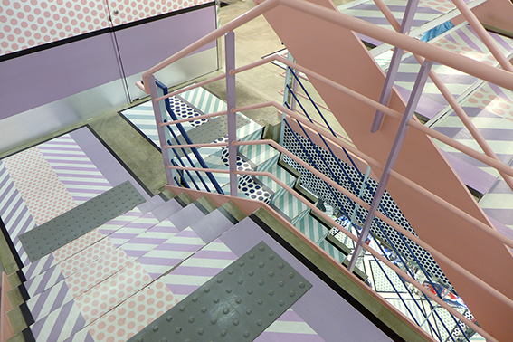
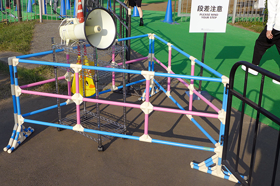
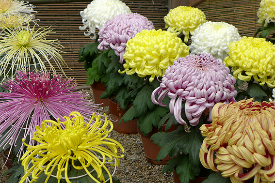

It's cold and grey out there – put a bit of colour in your cheeks.
(Tokyo/Tokyo/Okayama/Tokyo)
Don't stand up
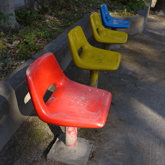
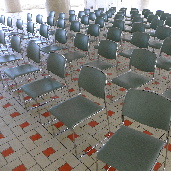
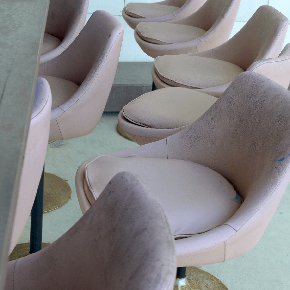

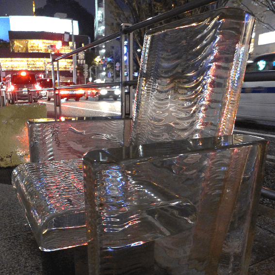
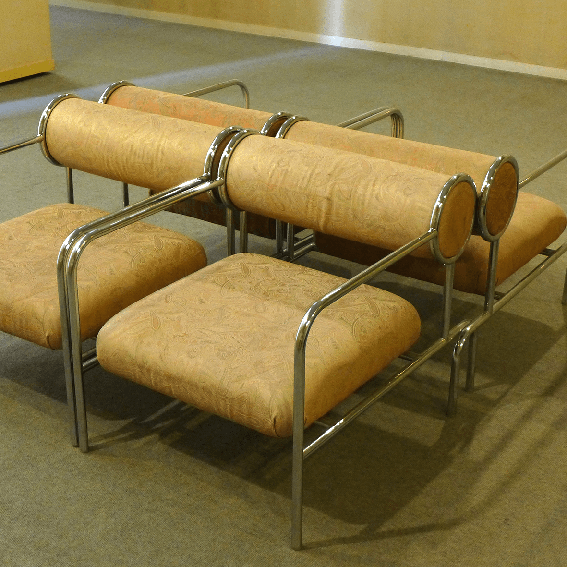
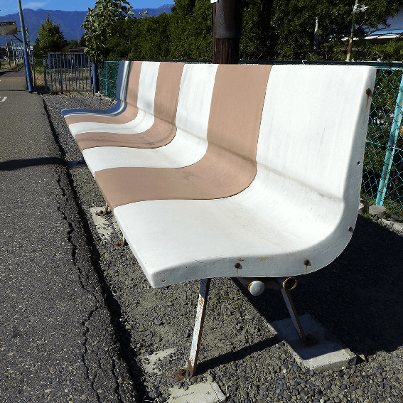
We recently went to see 'The World of Charles and Ray Eames' at the Barbican Centre. They're most famous for their chair design but they did so much more - graphic, exhibition, splint design (yes, you read that right), photography, film and multi-media work. Here's our response - a selection of Japanese seating.
The show runs until 14 Feb. You gotta catch it.
Let it snow
Ch-ch-changing f-faces
Horniman Museum and Gardens: Benefactors
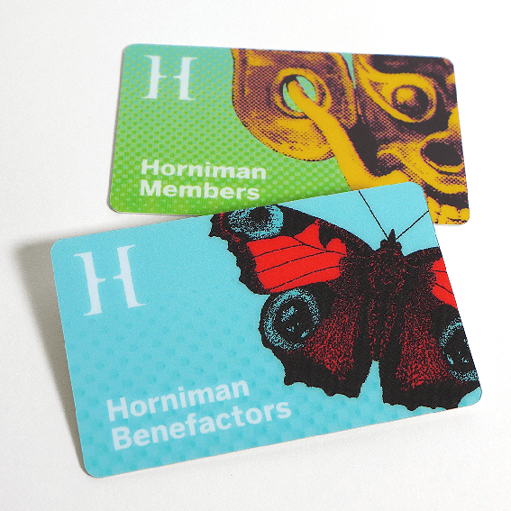
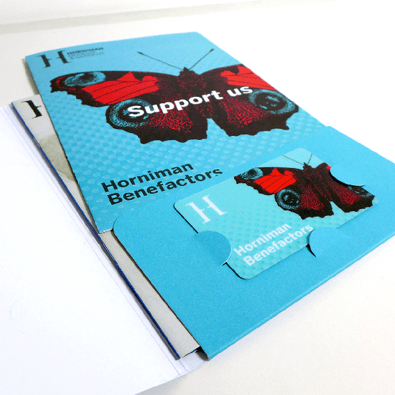
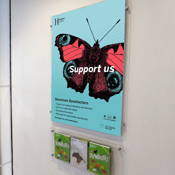
Over the last several months I've been working with Horniman Museum and Gardens to create an identity for the Benefactors' scheme re-launch. The brief was to make the design work in tandem with the Membership identity I created in 2013.
Just like the Membership scheme, I made a complete suite of materials: leaflets, folders, membership card, letterhead, posters, pop-up banners, web and email banners – the photos show a flavour. The technically-minded might like to know that I designed the folder cutter guide back in 2013 and we thought it'd be wise to re-use it for those all-important consistency and budgetary reasons.
As a client, Horniman Museum and Gardens strike that wonderful balance between being very responsive and engaged, showing real willingness to try new things and knowing when to step back and let me do what I do best. Marvellous. The butterfly seemed a good route as it represents both the collections inside the museum (the natural history specimens) and the gardens outside (the live animals).
Like much of our local community, Chutney Chorus are great fans of the Horniman. Where else can you find such a high quality collection of art, craft, musical instruments and natural history, to say nothing of the gardens and live animals ... and all this in a compact site? Makes you proud to live in South London!
If you're interested in joining the scheme go to:
www.horniman.ac.uk/get_involved/become-a-benefactor-today
Read more about the Membership scheme on our blog:
www.chutneychoruscreative.com/blog/horniman-museum-members
(post by Tanya)
Cooper's Yard Studios
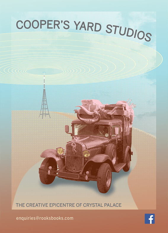
Chutney Chorus has moved to Cooper's Yard Studios. It's a friendly, exciting environment filled with creatives from across the board.
The governor of the studios asked us to create this campaign featuring his rather special motor. Keep your eyes peeled for him on the streets of South London.
