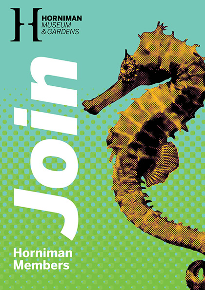
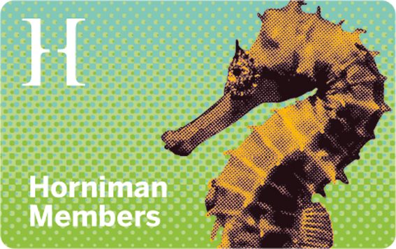
With so many wonderful changes underway at the Horniman Museum and Gardens, their marketing team decided to refresh the membership campaign to spread the news. I created the original suite in 2013/2014 so they commissioned me to update the lead image. We explored a few options but this lovely seahorse was the clear winner. As before, I rolled it out in multiple formats for print, web, and probably my favourite, the membership card. I'm happy to say the membership numbers got an instant boost.
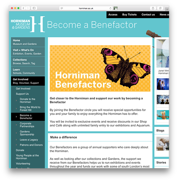
On a similar note, they also refreshed their Benefactors' campaign. I created the original blue colourway a few years back and supplied the assets for a yellow version which they banked until now. You can see the blue version via the link below. I'm still undecided whether I prefer the blue or the yellow... decisions, decisions.
http://chutneychorus.com/blog/horniman-museum-and-gardens-benefactors?rq=benefactor
(post by Tanya)
