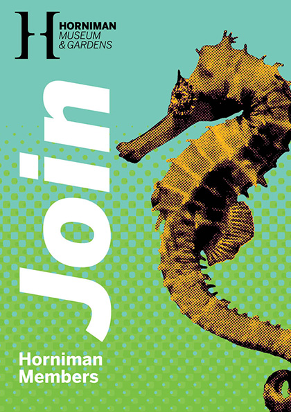
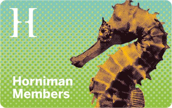
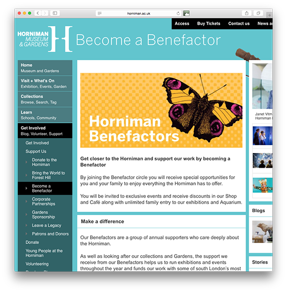
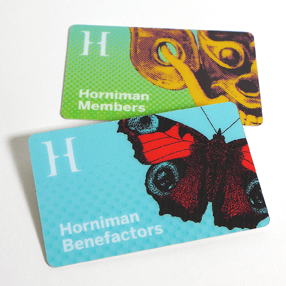
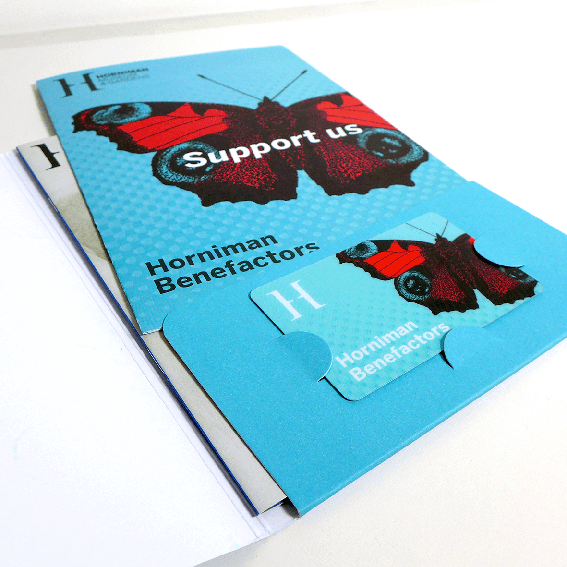
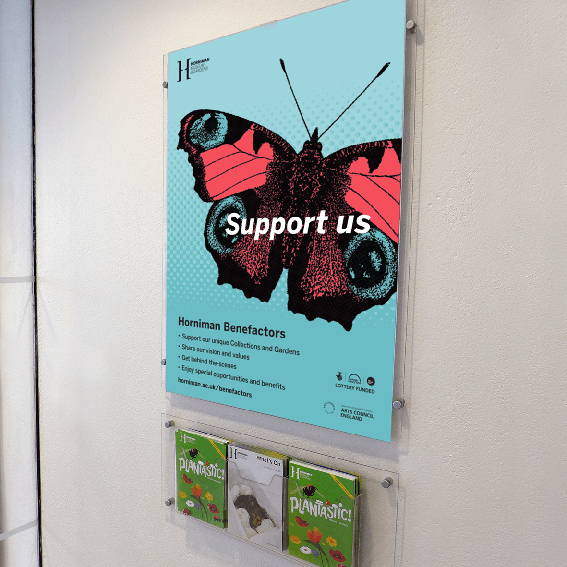
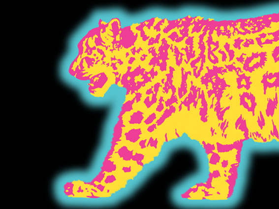
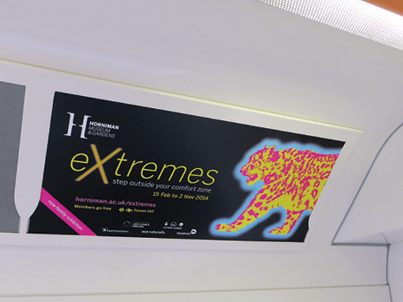
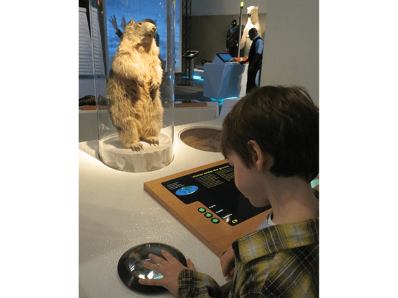
Over the last several months I've been working with Horniman Museum and Gardens to create an identity for the Benefactors' scheme re-launch. The brief was to make the design work in tandem with the Membership identity I created in 2013.
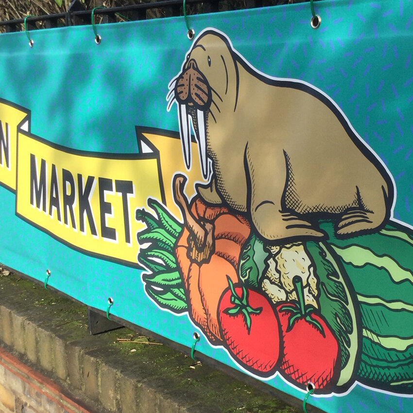
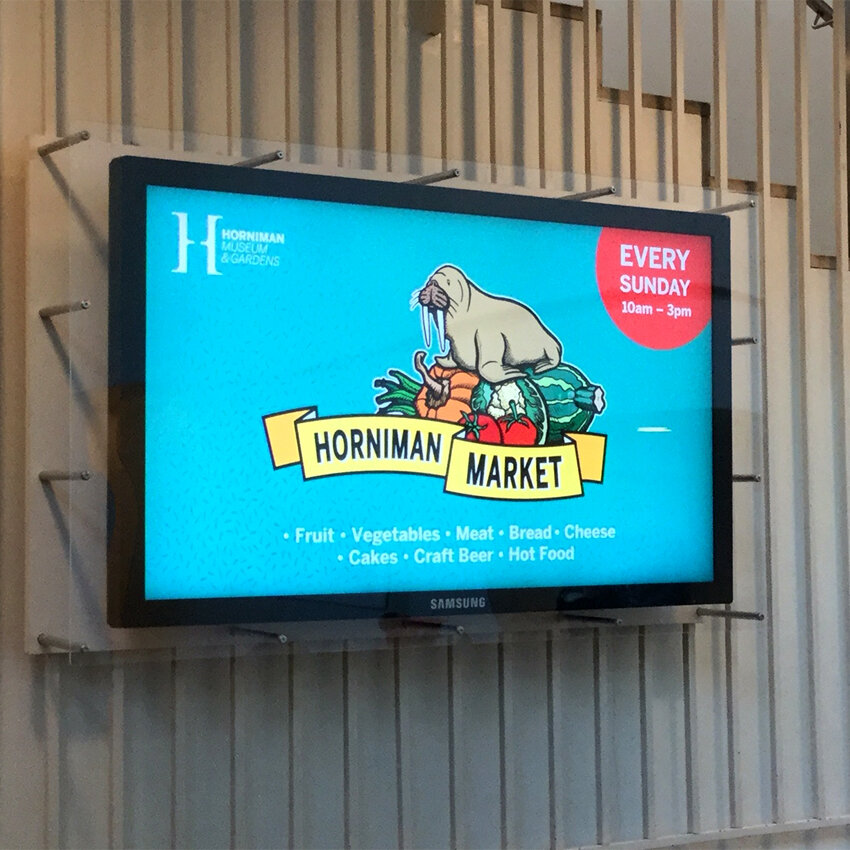
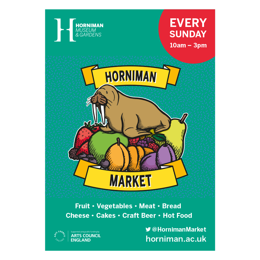
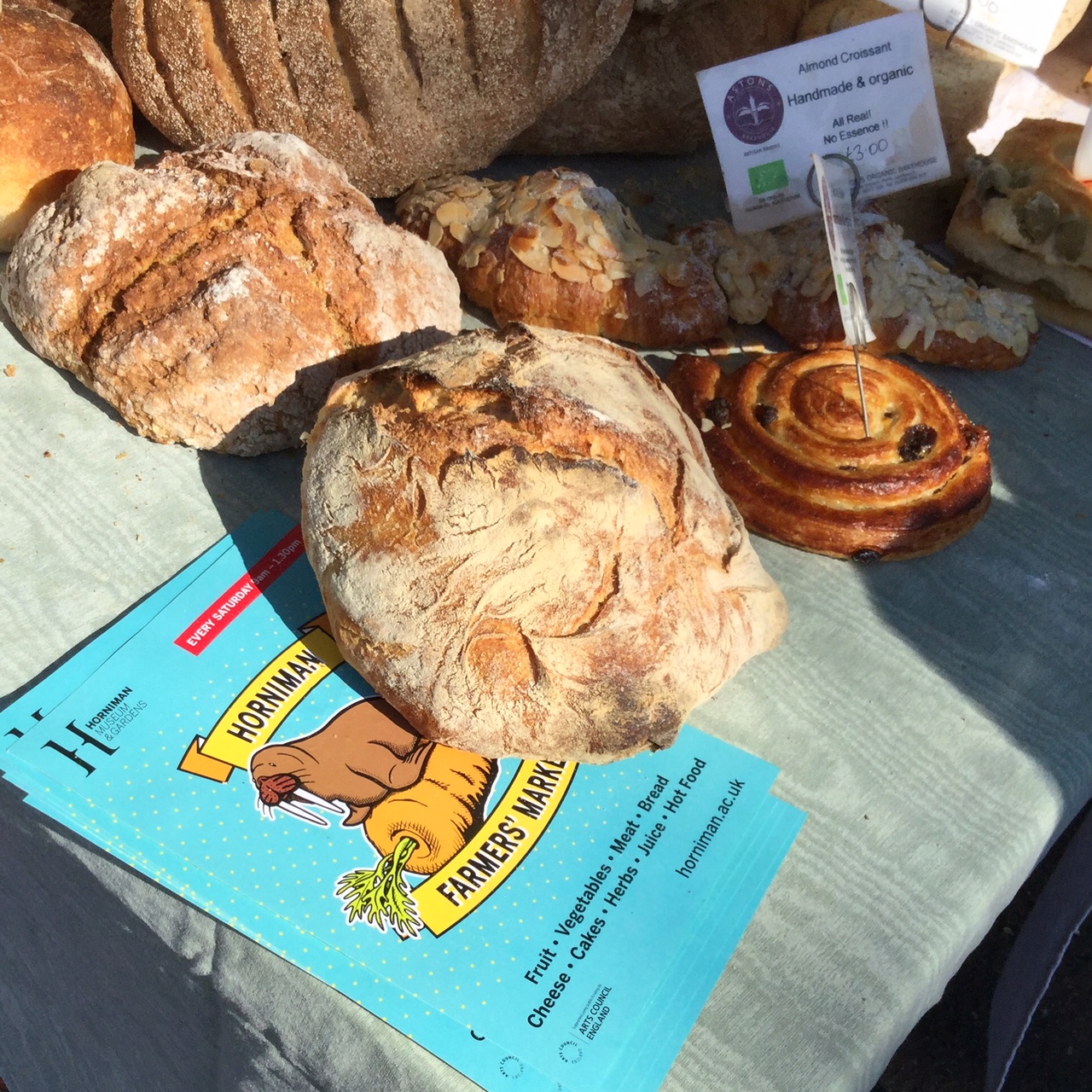
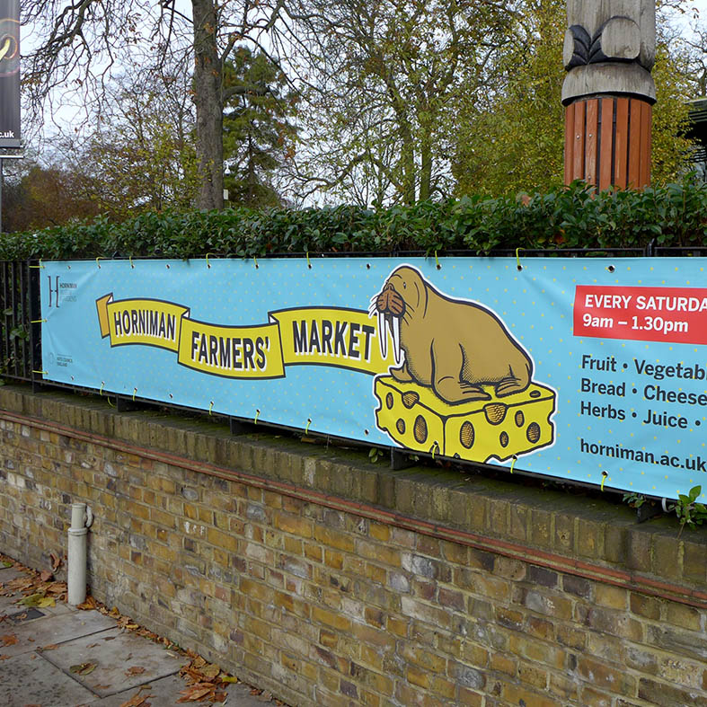
Just like the Membership scheme, I made a complete suite of materials: leaflets, folders, membership card, letterhead, posters, pop-up banners, web and email banners – the photos show a flavour. The technically-minded might like to know that I designed the folder cutter guide back in 2013 and we thought it'd be wise to re-use it for those all-important consistency and budgetary reasons.
As a client, Horniman Museum and Gardens strike that wonderful balance between being very responsive and engaged, showing real willingness to try new things and knowing when to step back and let me do what I do best. Marvellous. The butterfly seemed a good route as it represents both the collections inside the museum (the natural history specimens) and the gardens outside (the live animals).
Like much of our local community, Chutney Chorus are great fans of the Horniman. Where else can you find such a high quality collection of art, craft, musical instruments and natural history, to say nothing of the gardens and live animals ... and all this in a compact site? Makes you proud to live in South London!
If you're interested in joining the scheme go to:
www.horniman.ac.uk/get_involved/become-a-benefactor-today
Read more about the Membership scheme on our blog:
www.chutneychoruscreative.com/blog/horniman-museum-members
(post by Tanya)
