Wishing you a restful holiday season. Put your feet up.
D is for ...
(post by Mike)
Blog log
We've decided to blog every two weeks from now on as we have other exciting projects in the pipeline that need all our focus, love and attention.
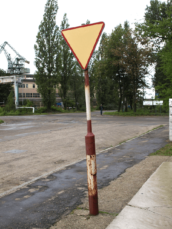
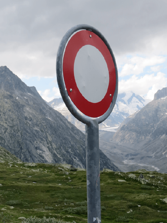
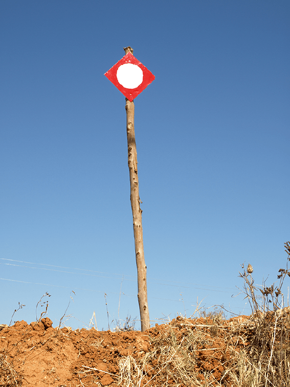
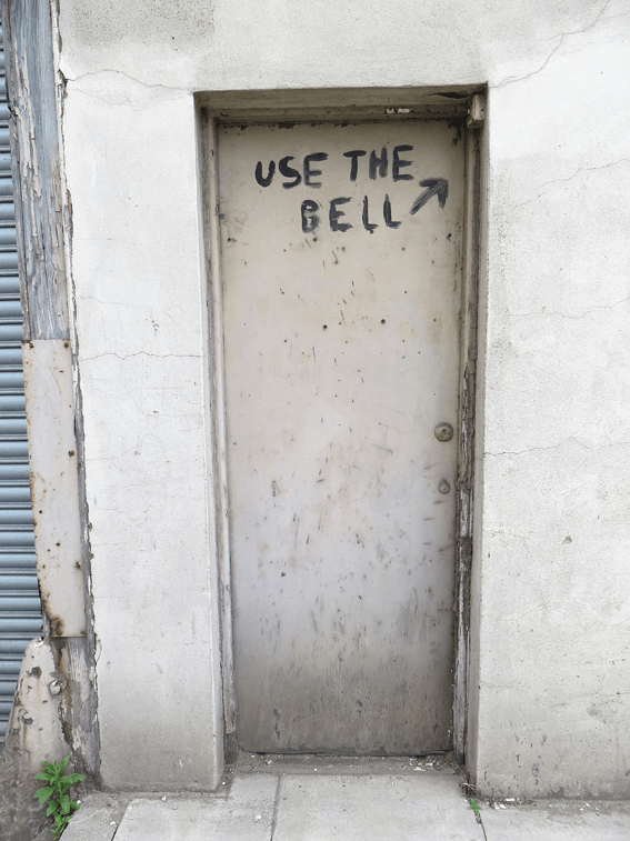
Drawing a blank
Feel free to print out these signs, fill with your own design and send to the relevant authorities in Poland, Switzerland or Spain.
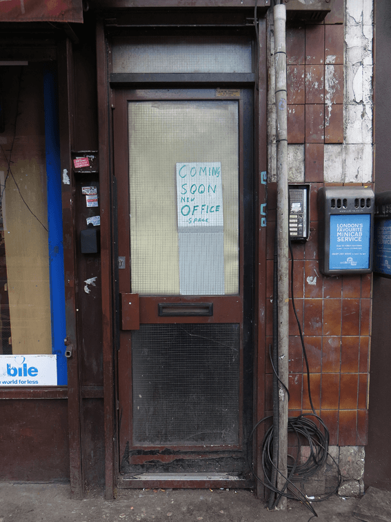
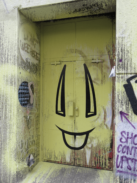
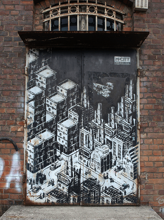
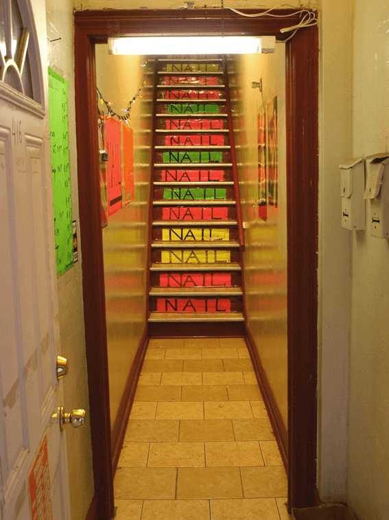
Door-to-door
Behind every door, there's an opportunity ... or a nail bar.
(Taken in London, London, London, Gdansk, New York).
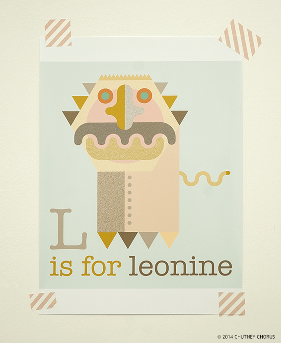
L is for ...
You know how sometimes you wake up in the morning and think to yourself, I've got to do me an illustration of a man/lion or a lion/man ... ?
(post by Mike)
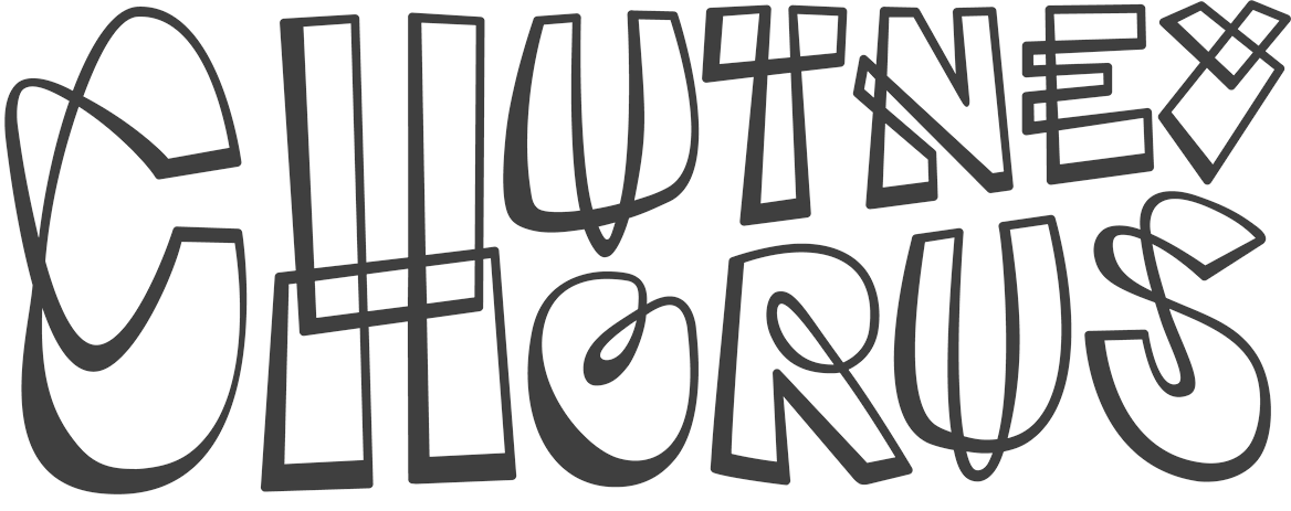
Block off
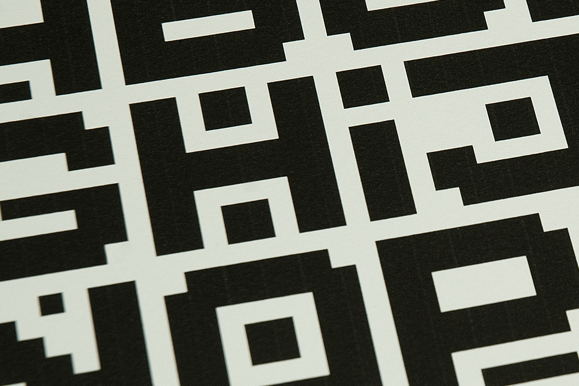
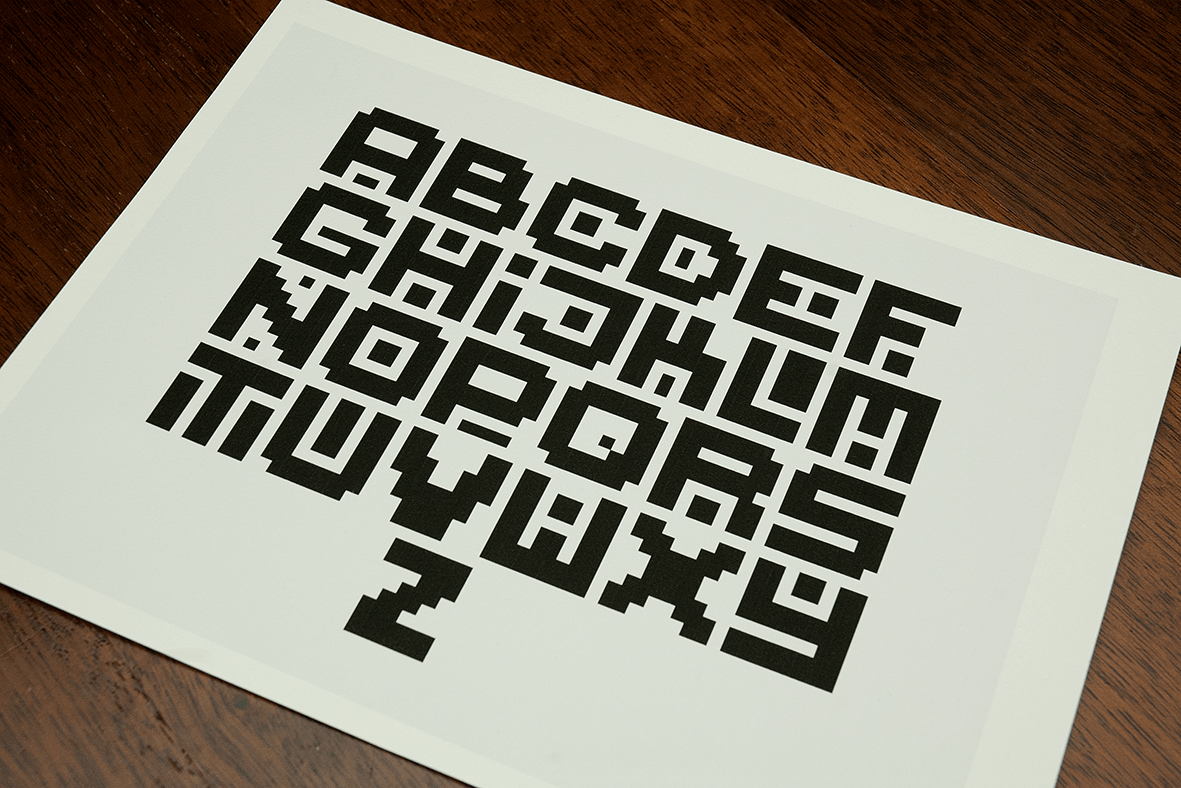
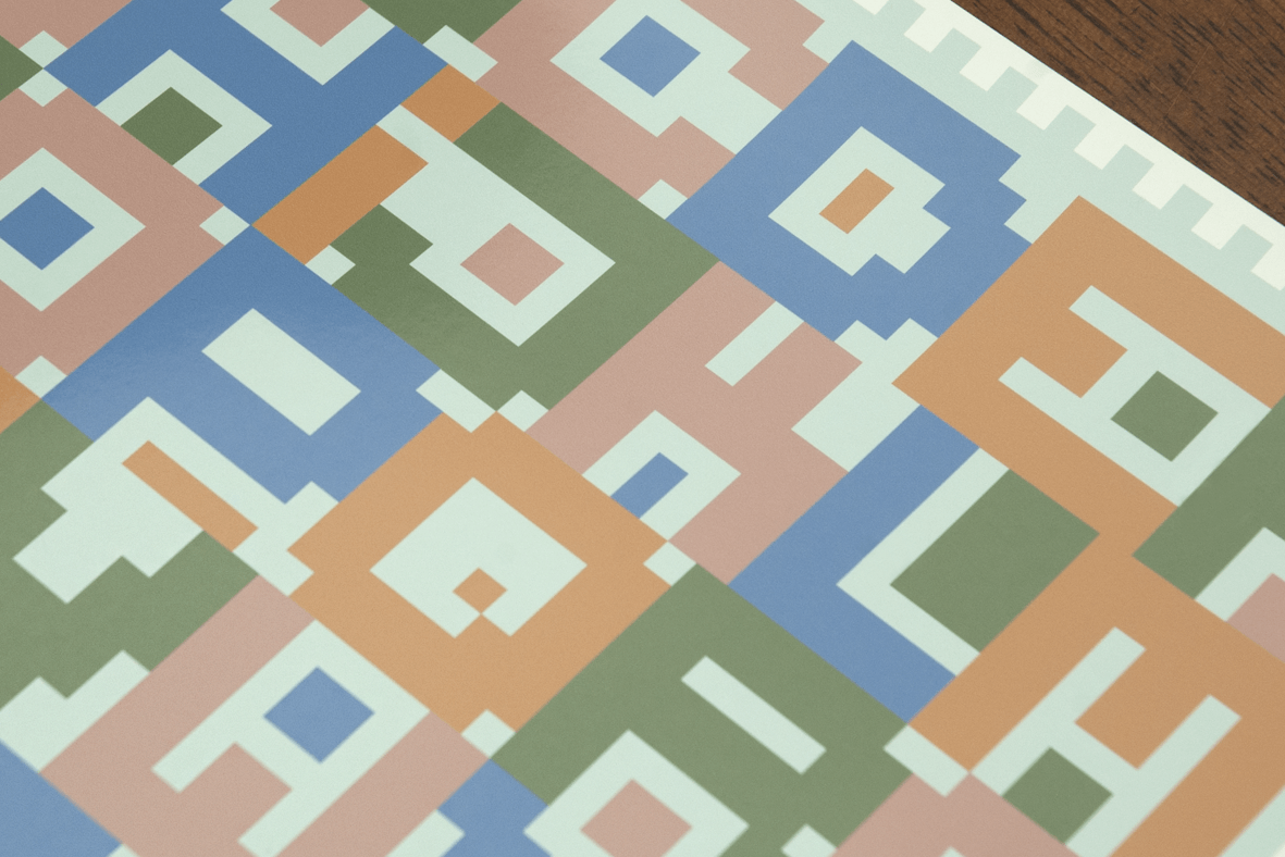
This week, I wanted to design a blocky typeface and this is the result. I created in colour first, then went on to the black version. It's interesting that the colour version becomes abstract because it has no tracking and no leading. Give it a bit of air and the letters come into focus.
Jargon-busting:
Tracking is the spacing between letters
Leading is the spacing between lines
(post by Mike)
Cameraderie
Our friend Ants has been very generous and given us his old Nikon D70. We're embracing the chance to work on our photography skills, hopefully becoming less point-&-shoot and more ponder-&-shoot. Here's one of our first shots – it's of this year's New Year card, designed and illustrated by Mike. This is the first step in improving the images on our site. See the rest of the images here:
http://www.chutneychoruscreative.com/#/print-new-year-cards/
Special thanks to our buddy Paulette for providing the lovely sashiko embroidery.
Imperial War Museum, Horrible Histories® Spies
The Imperial War Museum, London have kindly allowed me to use their images of Horrible Histories® Spies. I designed the wallpaper, stamper trail and an interactive for this exciting exhibition for children. Check out the new images here:
http://www.chutneychoruscreative.com/#/exhibition-imperial-war-museum-horrible-histories-spies/
(post by Tanya)
Johnston woodblocks


Johnston has been the official typeface of public transport in London since 1916 and is still going strong. Edward Johnston was commissioned to design a clear display typeface – the resulting sans serif Johnston embodies the efficiency of the Underground system. I took these pictures at the London Transport Museum Depot, Acton where there's a well-used chest of the complete font family.
Its clean lines inspired Eric Gill, his pupil, to create the hugely influential Gill Sans. Over the years, Johnston has been tweaked and updated, creating different versions such as Johnston Delf Smith and New Johnston.
(post by Mike)
