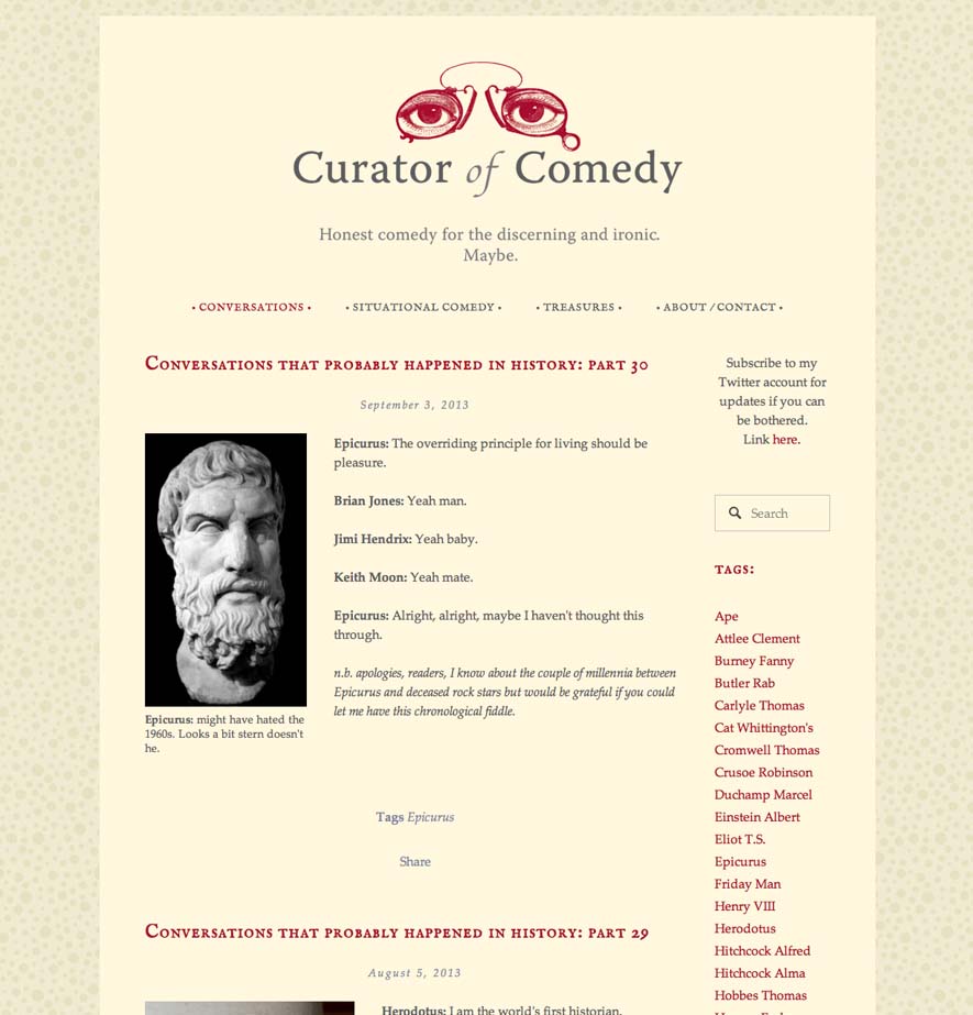
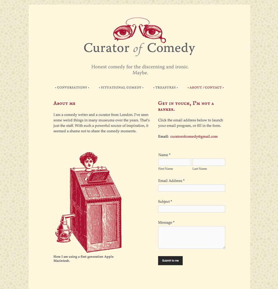
I've had the enormous pleasure over the last few weeks of creating an identity for a comedy writer. These unique jobs don't come along very often, so I really relished the change as well as the challenge ... and with a name like 'Curator of Comedy', how could I resist? Taking my cues from the client's tag-line 'Honest comedy for the discerning and ironic. Maybe.' and the fact that the content is historical, I thought a reference to the bygone would be the way ahead. Colour, type and graphics all have a historical feel. The eyes have an all-seeing gaze and create an engaging brand that works with the writerly style of type. (In hindsight, the eyes also reminded me a little of the 'TJ Eckleburg' eye graphic in 'The Great Gatsby' which was a happy accident.)
The client wanted a brand that could be used across a website, subscribe emails and Twitter account too so I created those during this first stage of work. (The next stage is stationery which will happen later in the year).
The Twitter identity was interesting as I've never done one before. A simplified version of the eyes seemed to make sense for the icon as it has to work in a small square. One slightly challenging issue was the black gradient over the banner picture which it isn't possible to change ... Knowing I had to work within that restriction, I put a bold graphic of a woman behind the eye icon which gives a kind of cyclopean effect and hopefully adds another layer of humour.
http://www.curatorofcomedy.co.uk/
(post by Tanya)


