This week we'll be covering another pattern technique that works well for symmetrical designs and dense regular patterns. It's more of a discussion than a step-by-step, as we're aiming to show you a pattern 'logic' that can be used for virtually anything you create.
We should add that once you've tried all the techniques in our three part series, you may find they're somewhat interchangeable, and that you prefer one over the others ... finding out what suits you best is what pattern design (and life) is all about.
Keeping it whole
Just like part 1, start with a regular square or rectangle which, for the purposes of this week's technique, we'll call a 'bounding box'. The bounding box defines the edges of your design and as you'll soon discover, the edges are where you'll need to focus your energies.
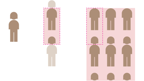
When creating your design, bear in mind that if a shape is cropped by the bounding box, the remainder of its parts must, must, must appear in the opposite spot. To use a simple analogy, it might help to think of each shape as a person. If a person's head is cut off by a bounding box, then their head has to be reinstated in exactly the right spot on the opposing side. Why? So that when the pattern is repeated, their head and neck join in the correct place with no anatomically bizarre results.
OK, so that sorts out the horizontal sides of the bounding box ... but what about the verticals? Well, once again, if a person is cropped by the vertical sides of the bounding box you have to make them whole again. Let's say that 70% of your person is within the bounding box on one side, then the remaining 30% of their body parts must appear in the opposite spot.
Remember: accuracy is key. See what happens when you get it wrong ... if the parts don't rejoin precisely to create the whole, things can get a bit nasty. Ugh!
Bridging the north/south divide
Using this principle, we've made this pattern: notice how the coloured shapes bridge the bounding box so the remainder of their parts have to appear in the opposite spot. When tiled, north joins south and east joins west.
In this version, we've added more shapes. Again north joins south and east joins west but as one of the new shapes bridges the corner, its remaining parts have to appear in all corners.
Simple, right? Now let's see how this works on something a little more dense.
It's all about the edges
Believe it or not, the banner pattern at the top of this post uses the same north joins south, east joins west principle. Our golden rule for all pattern design is 'it's all about the edges'. (We're often heard chanting this late into the night). Symmetry submits to this rule really well as we've seen, but it also applies to more complicated designs.
Let's look closely at our banner pattern. We've stripped out the middle of a single tile below right to focus on the all-important edges. Note how the cropped purple crosses for example, meet with their remaining parts in the opposite spot so when we repeat this guy, all is totally seamless. In theory, of course, we could throw anything we wanted into the middle and the pattern would still tile like a dream (but we didn't want to, so we won't).
It may take a little time to get limber with this logic, especially with your more complex creations, but stick with it and you'll soon be fluent.
That's it for this week. We've got one more technique up our sleeves which we'll share soon ... What are you waiting for? Run along now and make some patterns!
How to make a repeating pattern: part 1
How to make a repeating pattern: part 3


